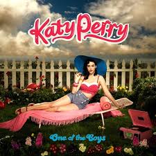
|
| Front cover |
 |
| Inside panels |
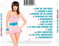
 |
| Back cover |
Idea one:
Front cover- We chose to have a close up of the females face on the front so that the audience knows its about her and they can immediately focus onto her. Filling most of the front with her face, then allows the audience to identify with her, and is able to see her emotion. The two different types of font that are used in this image help create feeling in the image, as the 'On My Own' writing is curly and handwritten which gives the image a more personal feeling. The 'Alice Hare' writing, is bold but small which allows the writing to stand out against the background, and we didn't want writing to take focus away from the image.
Inside panels - On the inside we wanted to have the lyrics down the left hand side, so that the target audience would be able to understand how the singer is really feeling and understand her situation more. We also wanted to have the flower also on the inside as this object is quite feminine, and also implies that she is quite a girly girl but it also has the connotations of innocence.
Back cover - On the back cover we chose to have the female walking away down the path which we see at the start and the end of the video, and we thought the best place to put this image was on the back so that it looked like she was walking away from everything, we placed this image on the right hand side so that the track listing could go on the left. Also the record company logo, copyright information and the bar code went along the bottom so that it wouldn't take away any focus from the rest of the image on the back.
 |
| Front cover |
 |
| Inside panels |
 |
| Back cover |
Idea two:
Front cover - We placed the female on the left hand side of the image, but only showing half of her face so it left that sense of mystery with the image with not showing everything so it wouldn't give it all away at the start. The two different types of font used help to create a sense of emotion, 'On My Own' writing is bold and simple so that it implies its getting the message across straight away whereas the 'Alice Hare' writing is fancy but yet simple so that it shows there are two sides to everything, just one side some people don't realise. We were going to place something on the right hand side of the image in the background but didn't know what, as we wanted something that connotes the romance genre, but something that didn't take any focus away from the female.
Inside panels - On the inside we chose to have the lyrics down the left hand side again, but then placed footprints along the right as this connotes that someone that once was there but not anymore which fits with the theme of the song, that she used to have something but she doesn't have it anymore. The background would be plain so then it wouldn't take away any focus from the images.
Back cover - On the back we wanted to place the female on the left hand side and then take a long shot of the beach, as this would highlight her isolation and the beach was a good place to show how alone she feels now. The track listing would be in the middle of the image, but placed where the sky would be so that the writing would stand out against the background. The record company logo, the copyright information and the bar code would again be placed at the bottom of the image so that they don't take away any focus from the image.
 |
| Front cover |
 |
| Inside panel |
 |
| Back cover |
Idea three:
Front cover - We chose to place the female on the left hand side of the image, but have her looking down to the right as if she was distracted that there is something that reminds her of something, which is another feature of heartbreak. Her expression on her face, would be just simple and down so that the audience could see that she isn't happy and something is on her mind. The writing again would help show emotion 'On My Own' writing would be bold and normal sized font, so that it doesn't take away focus from the female but it does stand out to the audience and they can see what the whole song is about. The 'Alice Hare' writing would again be quite fancy but yet simple so that it stands out against the title of the song, but would be smaller as it isn't as important as the title.
Inside panels - We wanted to place the lyrics again on the left hand side of the image so that the audience could feel like they understand the situation of the female more. We chose to place the egg timer on the right hand side as this is an object that we used in our music video, as we felt that it was different to a clock and you could actually see the time slowing fading away, and something that you won't be able to ever get back again, which fits with the females situation about something that she used to have but she doesn't have it anymore. The egg timer is simple and different to a clock which you see every day and we wanted something different.
Back cover - On the left hand side we would place the track listing, so the audience could see what songs are included, but also it wouldn't take away any focus from the image of the female on the right who we would position showing that she is ready for anything, and isn't going to let anything get in her way anymore, which again is a connotation of what happens after heartbreak as people pick themselves back up again and carry on. The copyright information, the company logo and the bar code would be placed down the bottom so that no focus is taken away from the image and also so that it looks professional.


.JPG)
.JPG)